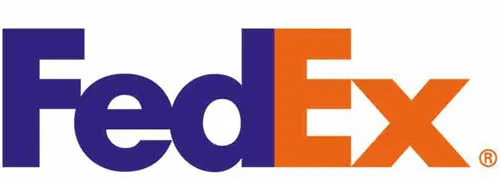
I remember when I first discovered the hidden symbol inside the FedEx logo.
I thought it was so creative the way they used the negative space in between letters to create a symbol, so I started researching other company logos with hidden messages.
It’s a fascinating concept… to play tricks on the eyes simply by using letters, lines, and white space in unique ways in order to create meaningful business logos that often have double meaning. Amazon is another company that does it so well. (See below.)
Following are 15 hidden symbols inside company logos that are pure genius!…
15 Company Logos That Play Tricks On Your Eyes
There are actually tons of examples of hidden messages inside company logos. But these are my favorites because they’re companies that we see — and use — every day.
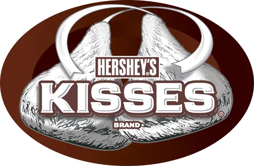
#1 – Hershey Kisses
Similar to the FedEx logo mentioned above, do you notice the Hershey Kiss on its side between the K and the I?
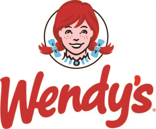
#2 – Wendy’s
Notice the word “mom” in Wendy’s shirt collar? Wendy’s claims this was unintentional.
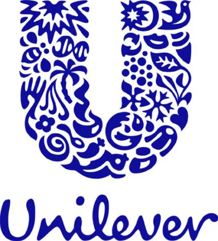
#3 – Unilever
For a company that represents a lot of different products, their logo includes 25 different icons that signify something unique about their business.
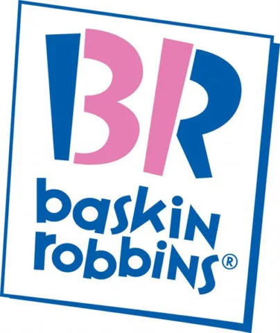
#4 – Baskin Robbins
Part of the B and part of the R are used to create the number 31, the number of flavors that Baskin Robbins offers.
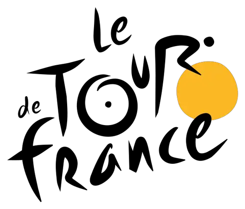
#5 – Tour de France
Notice the bicyclist between the O and the yellow dot? The letter R forms the cyclist’s body in the Tour de France logo.
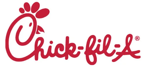
#6 – Chick-Fil-A
How long did it take you to notice the chicken’s head that’s incorporated into the letter C? But wait there’s more!… The letter A is capitalized to symbolize “top quality” or “Grade A.”
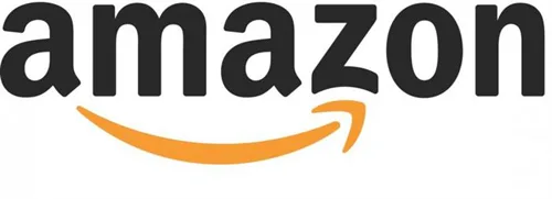
#7 – Amazon
The yellow arrow is actually a smile that stretches from A to Z, subtly reminding people that Amazon has everything from A to Z… and they’ll put a smile on your face. The funny part to me: I always saw the smiley face, but never saw the arrow.
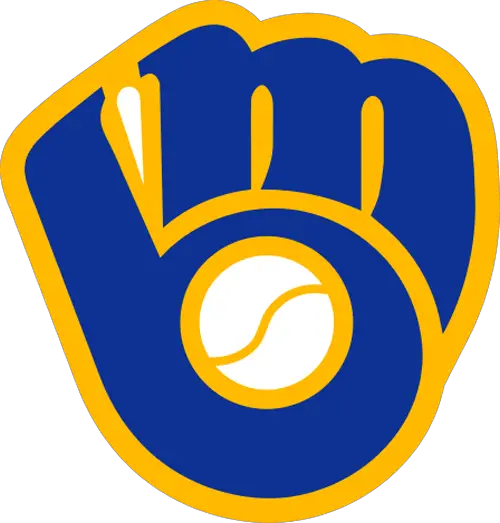
#8 – Milwaukee Brewers
While it looks like a baseball mitt at first glance, it’s the creative use of the letters M and B that actually form the glove in this classic Milwaukee Brewers logo.
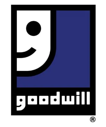
#9 – Goodwill
What looks like a smiley face in the upper left corner is actually the letter G for Goodwill. The lower case G is also a smiley face.
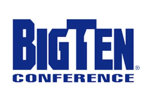
#10 – Big Ten Conference
Notice the number 11 in between the G and the T? In 1990, Penn State became the 11th member of the conference. This is how they acknowledged 11 teams in their logo. After Nebraska was added to the conference in 2011, the Big Ten conference logo was changed again — this time without any hidden reference to the number of member institutions.
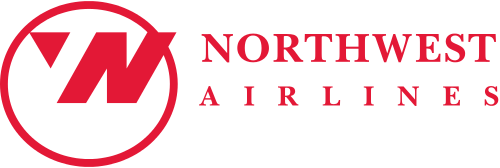
#11 – Northwest Airlines
Talk about hitting all the high notes in the least amount of space! Notice the creative placement of both an N and a W in the upper left corner, thanks to creative use of negative space? Now imagine that circle is a compass and the triangle is a compass that’s pointing Northwest?
#12 – Tostitos
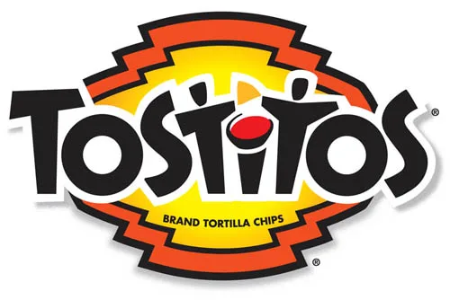
How long did it take you to notice the 2 people dipping a Tostito chip into salsa between the two T’s in the Tostitos logo?
#13 – Pittsburgh Zoo
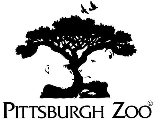
What appears as a bushy tree with birds flying overhead is actually another creative use of negative space. Notice the gorilla and lion staring nose-to-nose at one another in the Pittsburgh Zoo logo?
#14 – Formula 1
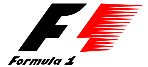
Another creative use of negative space. Notice the number 1 in the negative space after the F in the Formula 1 logo?
#15 – NBC
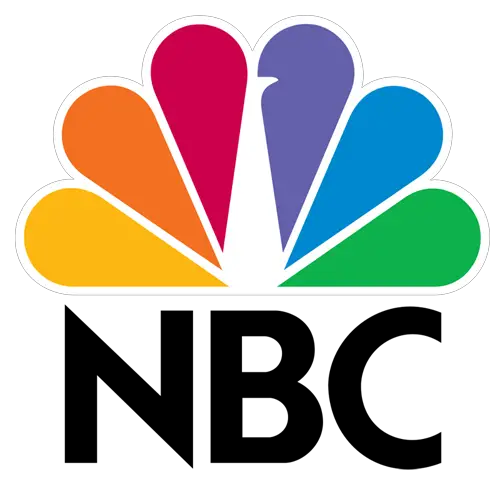
NBC was at the forefront of color television programming. They introduced their first colorful peacock logo in 1956. The 6 brightly colored feathers represented the 6 divisions of NBC (News, Sports, Entertainment, Stations, Network, Productions) at the time. With the 1986 redesign of the NBC logo, the peacock in the center began looking to the right — symbolizing the company looking forward.
Business Logos With Clever Designs
Okay, you’ve seen HOW a number of companies made the most of creative logo design. Now, in this video, see WHY some popular company logos look like they do — from Dell to AT&T to Wikipedia:
Next, just for laughs, here is Jay Leno’s take on hidden messages inside company logos:
And finally, this last one has to do with a hidden symbol found in the Coca-Cola logo and how it was used to spread happiness and joy:
The lengths they went to for that one reminds me of the airline (WestJet) that gave their passengers amazing (expensive) Christmas presents. So fun!
More Company Logos With Hidden Symbols
There are lots more examples of really creative business logos, many are
- Logo Designers Get Creative With Secret Symbols
- 50 Really Creative Billboards
- Hidden Messages In Famous Sports Logos
- 100+ Creative Business Logos With Hidden Messages
- Famous Logos And Their Real Meanings
- Hidden Meanings In Popular Logos
- 55 Creative Logo Designs With Hidden Messages
I like to help people find unique ways to do things in order to save time & money — so I write about “outside the box” ideas that most wouldn’t think of. As a lifelong dog owner, I often share my best tips for living with and training dogs. I worked in Higher Ed over 10 years before switching gears to pursue activities that I’m truly passionate about. I’ve worked at a vet, in a photo lab, and at a zoo — to name a few. I enjoy the outdoors via bicycle, motorcycle, Jeep, or RV. You can always find me at the corner of Good News & Fun Times as publisher of The Fun Times Guide (32 fun & helpful websites).

